Introducing Rallly 3.0 - What's new?
Rallly 3.0 is a significant stepping stone as we head towards expanding Rallly with more features. Check out the post about the future of Rallly if you'd like to learn more about where things are going, but in the meantime let's go over this update in detail and I'll explain some of the changes that were made.
Navigation
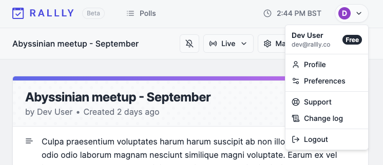
Rallly 3.0 features an updated UI that lets you navigate between screens quickly and easily. This will also enable even more pages and features to be added in the future so keep an eye out for that.

Polls page
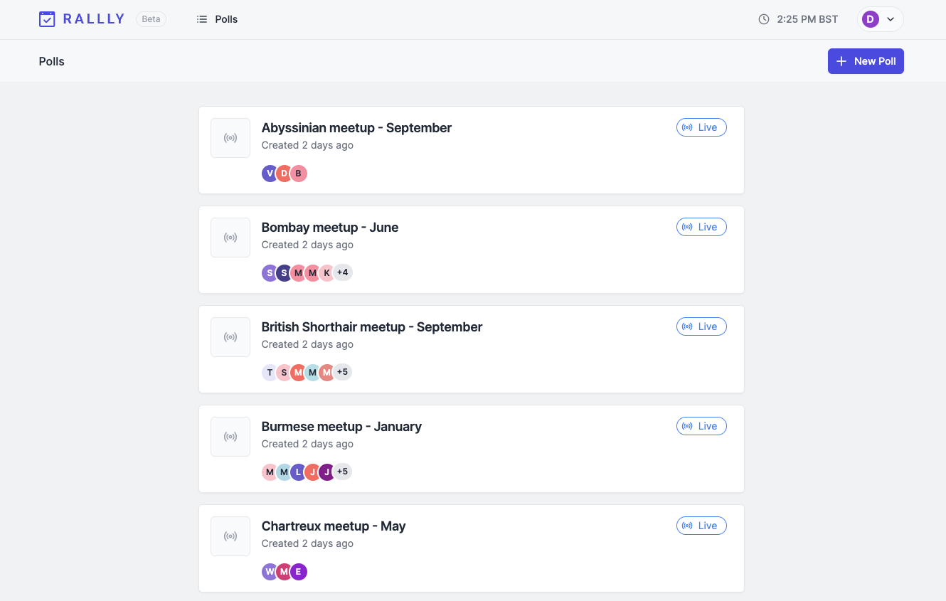
The new polls page gives you an overview of all the polls you created as well as their status. This replaces your polls being listed on your profile page.

Poll Status
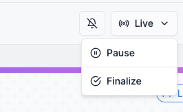
Rather than locking a poll, you can now pause it to prevent changes from being made to your poll. This change in terminology was done to compliment the new finalization feature which will be launched for Rallly Pro users.

Performance
You might notice Rallly feels faster than it used to. Some work has been done under the hood to improve how quickly pages are loaded and the responsivenes of the app.
Updated Scoring
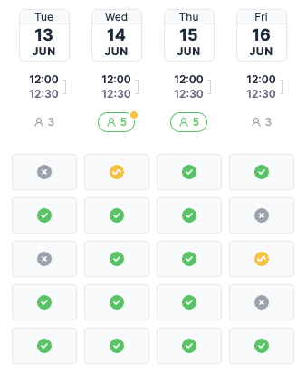
Scores are now visualized slightly different. Each option will show a number indicating how many participants are available including participants who voted "If need be". The highest scoring options will be highlighted in green and an amber circle indicates that one or more participants voted "If need be".

Conclusion
Thanks for following along and I really hope you like the new version. If you have any feedback I'd love to hear from you.