Mobile Poll UI Refresh
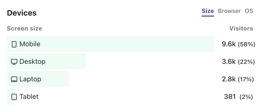
Did you know over half of all Rallly users are on mobile devices?

The first major update released just two weeks ago addressed quite a few usability issues already by introducing dedicated UI components for mobile devices and today we're building on top of that to deliver an even better user experience. So what's new?
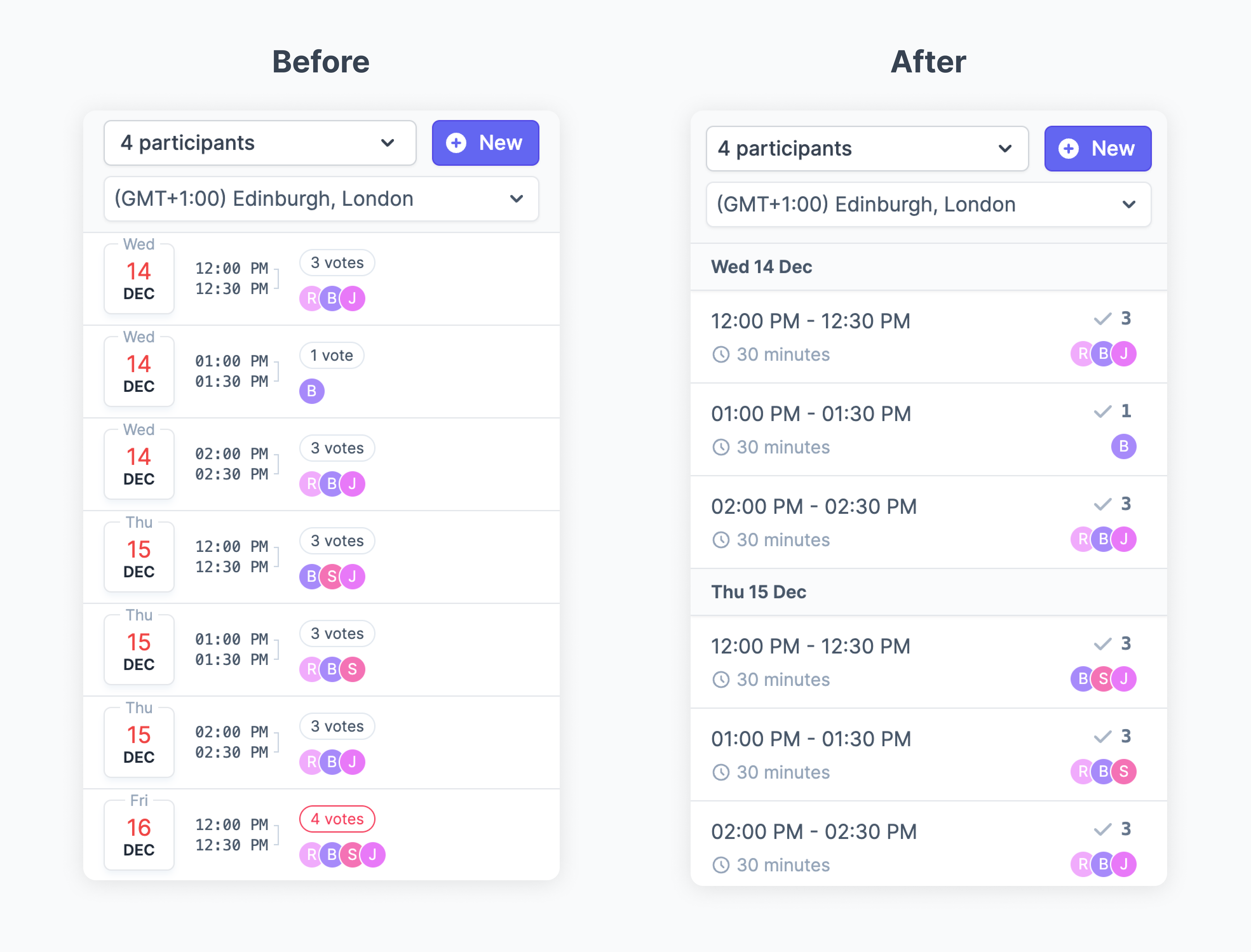
Grouped times
Times are now grouped by day. This removes a lot of clutter from the UI which should help with the overall readability of the page.

Animations
The update includes some sweet animations that are not only delightful but also help guide users to the right path. The name field and save button were often missed so the animations should help draw attention to them.
Increased touch area
Previously, you would need to touch the tiny checkbox on the right to toggle a vote. Quite annoying if you're on a tiny screen. Well that's not the case anymore. The entire row is now touchable so you don't need to be a marksman to select the right options.
In conclusion
Hopefully you will enjoy this update and find it useful. I work on things based on the feedback I get so why not send a tweet to @ralllyco or @imlukevella and let me know how you like this update and what you'd like to see next?